
Now you understand the basics of forex, but there’s still one very important thing you must understand before you begin your gold trading journey. Charts are the heart of technical analysis, which along with fundamental and sentiment analysis make up the three pillars of market analysis.
Simply put, if you don’t know how to read charts, you won’t be able to analyze the market from a technical perspective. If you lack technical analysis, there’s simply no way you can trade effectively compared to a trader using all resources at his or her disposal.
At this point in the journey, it’s understandable if charts look like nothing more than waves and lines. By the end of this lesson, you’ll have everything you need to read a chart and make an informed trading decision. We’re going to teach you how to read charts, how to identify key indicators, and how to recognize chart patterns. We suggest you test it out on a demo account first, and then open a live account once you’re comfortable.
- 3 Types of Charts
- What Type of Chart is Best for Trading?
- Reading Charts
[box type=”shadow” align=”aligncenter” class=”custom-blog-cta” width=”60%” ]Open your demo or live account today!
[button color=”green” size=”big” link=”/start-trading-today/” target=”_blank”]GET STARTED[/button][/box]
3 Types of Charts
Though there are many different chart presentations, there are three that stand out amongst the rest as the most popular when it comes to gold forex trading.
Line Charts
A line chart is the most basic available chart. It simply tracks the closing prices of a given currency pair (or USD/XAU pair) and draws a line between them. As these closing prices begin to accumulate over time, the trader can see the general price movement of the currency pair.
Here is an example of a line chart for USD/XAU:

Line charts can include the buy price, sell price, or average between the two, but only one price is listed at a time. While a line chart can be useful for a basic understanding of the price movement, beware that it leaves a lot of information off the table. There’s no way to tell what the movement was like between opening and close, and how much volatility is associated with the pairing in question.
Line charts offer very basic information and allow the trader to track trends based on the general price movement, however other charts are more detailed and thus more informative.
Bar Charts
Bar charts are much more detailed than line charts. They show the opening and closing prices, in addition to highs and lows, hence the alternate name OHLC (Open, High, Low, Close).

Bar charts are much more detailed and informative than line charts because they tell you everything you need to know about the general price movement and more specific volatility within the open and close periods.

Bar charts may be presented in a variety of colour combinations. In this example, green bars represent periods where the close is higher than the open. Red bars represent periods where the close is lower than the open.
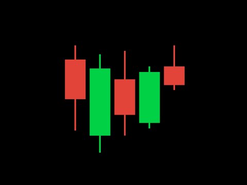
Candlestick Charts
Video courtesy of Trading 212
Candlestick charts contain the same information as bar charts – the open, the close, the high, and the low. However the difference between the open and the close is represented as the “body” of the candle.


In this presentation, a green candle means that the close was higher than the open during the given period. A red body means that the close was lower than the open during the given period. The high and low shadows (or wicks) are longer or shorter depending on how far they extended from the open or close price.
Which Type of Chart is Best for Trading?
As a trader, it’s entirely up to you. Bar charts and candlestick charts present the same information in a different visual format, while line charts include basic information that can serve as overview for the general price movement of a given currency pair.
Candlestick charts are the overwhelming favourites for many traders, but try reading different ones and trading on your demo account. Over time, you’ll uncover which chart is most suited to you.

Video courtesy of CMC Markets UK
Reading Charts
We’ve introduced you to the very basics of charts and how they are presented, but do you know how to read them in order to inform your trades? Technical analysis sounds complicated, but keep reading and it will start to make a lot more sense. Technical analysis is just examining the chart of a given currency pairing in order to forecast its future performance. Technical analysis equips you to know when to enter or exit the market.
First, we’ll start with the very basics. If you’ve ever traded stocks before, a lot of the same terminology and concepts apply to gold forex trading. So much so, that you may find this introductory video on reading charts and identifying price patterns to be very helpful.

Video courtesy of Investools

Video courtesy of Trading 212
Trend
Trend is the general direction of a currency pairing’s price movement. There are three kinds of trends: up (higher highs, higher lows), down (lower highs, lower lows) or sideways (roughly equal highs and lows). All types of charts will give you a feel for the trend.


Support and resistance
These are lines on charts that represent the trend of highs and lows. The currency pairing as trouble breaking through these levels. The highs generally never break above the resistance line, and the lows generally never break below the support line. When prices do break the support and resistance level, it may be an indication to make a move, because the price could continue to rise (if resistance was broken) or fall (if support was broken).
Tip: when the price breaks the resistance line, the resistance line could transform into the support line, and vice versa.

Price Patterns
Once you begin to draw trend lines and support and resistance levels, certain shapes and patterns will begin to appear. These shapes are known as price patterns. Once you recognize patterns, you may be able to forecast even more precise movements in the market. Price patterns can be simple shapes like triangles and flags, or they can be more complex and given names like “triple tops” or “head and shoulders.”

Technical Indicators
Trend lines and support and resistance levels are subjective. If ten traders were asked to draw their interpretations, you might get ten different answers. That’s why objective technical indicators can also be helpful. Indicators display price data in a unique way based on ratios, Fibonacci sequence, and other considerations. We won’t delve into the technical side today, but it’s important to be aware that there is a very advanced way to read charts beyond the open/close prices.
There is no guarantee of success, and there is always a risk of loss. However, when you understand how to read charts and use technical analysis to inform your gold trading, you are increasing the probability of big wins with gold forex trading.
Open your demo account now to get a feel for the different charts and technical indicators. Play around and see what suits you. Once you’re comfortable, open a live account and put all your training to work!
[box type=”shadow” align=”aligncenter” class=”custom-blog-cta” width=”60%” ]Open your demo or live account today!
[button color=”green” size=”big” link=”/start-trading-today/” target=”_blank”]GET STARTED[/button][/box]